Clarity

Clarity is a B2B product, intended for payroll reporters and accountants in Israel.
It is a SaaS platform that brings together all the relevant tools in one place.
The user can choose one of three packs of the product that fits the most for the company he works for, and start working directly in the WEB version.
My Role
UX, UI and Product Designer
User Research, Prototyping & Testing, Visual design
October 2019 - September 2022
Softwares used


Kick-off Meeting

In my introductory meeting with the product, with the CEO and COO, I understood what are the needs of the management, "where the wind is blowing" from the company's point of view and what is important to do and change to optimize the user experience, by their point of view.
The Challenge
Until my arrival to the company, it used outsourcing services when it came to product design and there was no department related to characterization and research. When I arrived, it was extremely important to set up these three departments from scratch and at the same time, continue to promote the product.
Gathering Information
After gaining access to Google Analytics, I was able to "open the light" on the company's data and understand how many users the product has, what they usually do when they log in, how long they stay in the system, what parts no user logs in and more.

Competitor Analysis
In order to understand the strengths and weaknesses of our product, I performed a competitor analysis by registering for portals and performing actions from their systems, I defined the products they offer, talked to them on the phone to understand how their sales system works, and compare prices to our same products.


Research Methodology
For the sake of getting comprehensive information from our users about a product I was not exposed to, I operated an online interview method using the Zoom software.
I set up online meetings with existing Clarity users, asked them to share their screen while they operated the software, and gave them various tasks to perform within the software.
I divided my insights from the zoom research by: speed of action, success / failure and understanding of the general action.
At the same time, I passed on to 100 other Clarity users a questionnaire, which contains 20 features of the software, some existing and some future. The same users received an imaginary budget of 10,000 NIS and were asked to budget the features that they think should be implemented or improved in the system. Users had to write in their language, why they chose the first three features they chose and also rate those features in terms of importance.

Arranging the insights
I wrote on papers all the things that bothered our clients. I divided them into three categories: technical problems in product operation, the user's emotional relationship with the product and suggestions for improvement.


Emotion Heat Map
Based on the personal interviews & questionnaire, I got a picture of the emotions our customers experience while working on the software. The more times I heard the words, the greater the direction in which this amorphous shape progressed.

Data-Based Personas
After receiving the data from the company's executives and the users themselves, I was able to build data-based personas for three different users of the product.


User Journey
Based on all of the data I collected, I created a journey map for the three personas I created, in order to demonstrate their reaction during navigating in the system.

Feature Ranking
Back to the Surgeons' Table: The CEO and VP Projects of Clarity, have been waiting for me with the insights from the research I did. Together with them, we re-created the feature prioritization of the software according to the amount of personas that use those features and their frequency, gave a stage to new features that came up as a success from the research and got an understanding of which features should be taken off the shelf.
This information would be used to ensure that future design efforts align with the features end users desire. Additionally, the findings could help prioritize both design and development efforts.

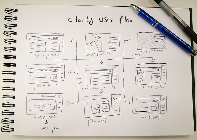
User Flow
We closed the list of features that are going to come up in the new version, we knew what things are important for our users to see and mostly- we knew what the users don't want to see. I started sketching the information architecture - the screen tree that shows where the user moves within each click (below is one of the pages).
Sketching
As an understanding of the need to rebuild each screen in the system, I drew the screens on a page, from the home page to the end-of-flow screens.

At first I tried to present a dashboard, which includes the important features for the users according to the results of the research, such as: task board for employees, establishment of an employee or new agent and the ability to share information to additional contacts in a systemic internal interface.

After another meeting, it was decided that some of the things presented are not relevant enough to the users and there is a need to show the employees who are under the responsibility of the same employer - the user. I lowered the search bar to the center and built the continuation of the interface around it.

Next, we came to the insight that we need to give even more emphasis to the employees, they are the essence of the users of our product. I built a table that shows more employees than the previous drawings, including quick actions that can be performed for them and I updated the header as well.
First Mobile Adaptation
At the same time, I started building first sketches for a mobile-adapted interface to a product that until now operated in a desktop-only interface. In the mobile version, the tasks assigned to users will be less complex and easy, ones that can be completed on the bus or at home, on the couch.
As part of the user questionnaire I conducted, I asked users which phone device they were using. The vast majority answered that in the SAMSUNG GALAXY devices in versions 4,5 and 6. I checked what the screen resolution of these phones was, and the result was 640X360. This was the resolution from which I started working on the new mobile version of Clarity.


Wireframing the Solution
One of the essential steps in the process, was the transition of the sketches to the computer. It was important to deploy the right resolutions according to the user research from this stage, in order to understand what size the elements could really be, on the screen.

Moving to the screen helped us understand the full picture and how much space we really have to put in the employee data. I added a side screen to help users understand and change employee information more conveniently, and some quick actions buttons for the employer and agent.

Next, I characterized a screen where important data for users displayed in the form of a dashboard as in the first sketches, with options for filtering the information by month and year.

The mobile wireframing was also made subject to the sketches and screen resolution data I received from the users themselves. The mobile interface and the operations in it, operated more in a "task" style and included the execution of clear steps such as setting up an employee, than the free desktop interface.

Usability Testing #1
I uploaded the Wireframes to our test environment and share them with a number of users from the first research session, in order to have another zoom session on the screens. Users wanted to change a few things like watching multiple employees on the home screen, other quick actions already on the internal employee screen and a different view of the dashboard. I got an OK from the management for changing the wireframes and started to make so.


Another Display Change
During the Covid-19 period, just before the transition to the final design, it was decided to change the base language of Clarity's new design and give users more information in a more "easy" and accessible look. Now, with the click of a button, employers can get much more information about their employees and take actions without switching between different pages.


Usability Testing #2
Getting ready for Design
After the last 2 major changes, I went up again in front of our experimental users in preparation for final usability tests before moving on to design. The instructions for the users this time were tailored to the changes we made. I guided them to report independently in the system, create a new user for themselves and more complex operations. Users performed the operations faster by 20% on average than in the first wireframes versions - we were ready to move on to the design phase.
Design Process
Creating a design system is critical to product continuity. Designers who will work for Clarity in the future, will know how to design new elements within the product easily while simply transferring the materials to the dev team. I created one style guide with information about the fonts, colors, spaces and other design guidelines.

Inspiration
The product is in fact a complex system, which includes a considerable number of features for the benefit of the users. As part of the market and competitor analysis I did earlier in the characterization process, it was necessary to observe successful complex systems in the market, employee dedicated, as well as design portals, see how their design behave and how all of these, can serve the users.

Desktop Solution
As part of the design transition, I decided to divide the users by colors, as part of improving the communication among themselves. When opening several different tabs in the system, you can know at a glance how many employee tabs have been opened, how many employers and how many agents. The options menu remains fixed on the right side from which you can navigate to other screens. At the top, there are suggestions for quick actions designed for the specific user.


Mobile Solution -
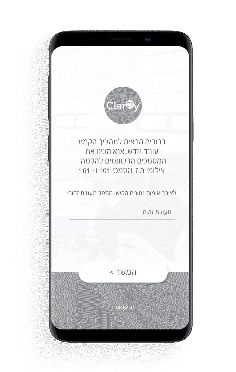
Meet Clary
As part of the product's transition to a mobile phone, there was a need for a guiding entity that directs users to perform the right actions for them at the right time, quickly, instill in them confidence and make the process much simpler and leading, properly for a mobile phone.
We have developed a character that can identify with both male and female users, and I chose to give it the name Clary - as a connection with the product name- Clarity.


Hands Off -
Developing the designs
I created high fidelity mockups and then imported them into Invision App to allow the developers to inspect the file and export the HTML and CSS code.
I worked very closely with the Front End team to spec out any missing interactions that were not covered in the high fidelity mockups. I conducted a UX review of each front-end ticket that was implemented to ensure it was aligned with the designs.
Due to information security issues, As for my website, I created a simpler mockups than the ones I transferred for development at the end of the process:
Results
Since the implementation of the new design, I made another Usability Test with our "core" testing users, and also new users who never been in a testing environment, which came up really well. many of the users were really thankful to me in person for making a big visual upgrade in their day to day software, and most of all freeing up time for doing other things.
Some users, mostly veterans, preferred to keep some features that did not made the final version, and were disappointed because of that. for those users, we clarify that those features might as well resemblance in a different mode in the future.
According to the company's marketing and sales department, the company's revenue increased by 10% in the first quarter after the new version went live and by 13% after the end of the second quarter. According to measurements made by the company, users stayed longer in the newer version of Clarity due completion of more tasks, and the percentage of abandonment (users who leave the system after viewing only one page), decreased by 5%.
My Takeaways from Clarity project
1. Creating more options in the characterization phase- in order to try and score as much as possible to the company's expectations and on the other hand - to the users.
2. Involve the developers as early as possible- in order to understand which of the elements could exist and which of the elements would require rethinking.
3. Deepening my knowledge in the field of data and analytics- this could help me get a better idea of users, long before the personal user research.
Making the world a better place
I was very happy to see tangible results with the help of data and numbers that show a positive change in the user experience that has taken place in the tens of thousands of Clarity users. That's why I do what I do and I love it!

Previous project
Class
User Experience in a special education school
Next project
M.V.P App
Mobile Experience for football fans and club managers